Creative English Brochure Design: Inspiring Layouts for Language Education
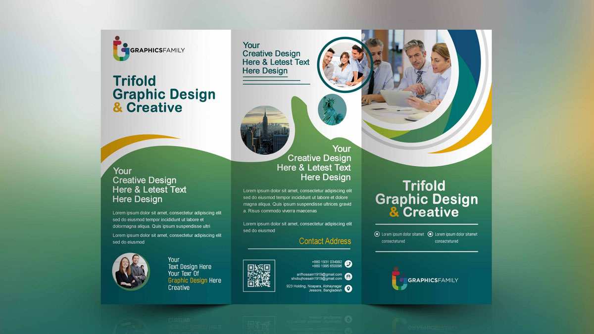
In the competitive world of English language education, a well-designed brochure is more than just a piece of paper—it's a powerful marketing tool that can attract students, communicate your teaching philosophy, and set your program apart. This article explores creative English brochure design inspired by international trends, offering practical ideas for educators and designers looking to make a lasting impression.
Why Brochure Design Matters in English Education
Prospective students and parents often judge a language program by its promotional materials. A creatively designed brochure conveys professionalism, creativity, and a welcoming learning environment. It can highlight your unique selling points—such as small class sizes, native-speaking teachers, or innovative teaching methods—in a visually compelling way. Moreover, with the rise of digital media, a tactile, beautifully designed brochure stands out even more, providing a tangible experience that screens cannot replicate.
Key Elements of Creative English Brochure Design
To create a brochure that resonates with your target audience, consider incorporating these elements:
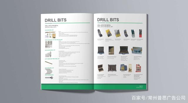
- Bold Typography and Playful Layouts: Use a mix of serif and sans-serif fonts to create visual interest. Creative layouts, such as asymmetric grids or overlapping elements, can make your brochure feel dynamic and modern.
- Multicultural Imagery: Since English is a global language, feature photos of diverse students and teachers. Images of iconic landmarks from English-speaking countries (e.g., Big Ben, Statue of Liberty) can evoke a sense of adventure and authenticity.
- Interactive Components: Include QR codes linking to sample lessons, virtual tours, or testimonials. This bridges print and digital, engaging tech-savvy audiences.
- Color Psychology: Choose colors that reflect your brand personality. Blue often symbolizes trust and professionalism, while vibrant hues like orange or yellow can convey energy and enthusiasm—perfect for a language school.
- Clear Call-to-Action: Don't forget to include contact details, website, and social media handles prominently. A compelling CTA like "Start Your English Journey Today" encourages immediate response.
Innovative Folding Techniques and Formats
Gone are the days of simple tri-folds. Creative brochures experiment with unique folding methods to engage readers. Consider these formats:
- Accordion Fold: Also known as a Z-fold, this allows for a step-by-step narrative, perfect for showcasing your curriculum progression from beginner to advanced.
- Gate Fold: Opening like a double door, this creates a sense of reveal and can be used to present a special offer or a welcome message.
- Die-Cut Designs: Cut-outs in the shape of letters or speech bubbles add a playful touch and can highlight key information.
- Poster Fold: A large poster that folds down into a brochure—great for including a map of the campus or a timeline of your school's history.
These formats invite interaction and make your brochure a keepsake rather than something to be discarded.
Learning from International Design Trends
Looking at brochures from leading English language schools in the UK, USA, Australia, and Canada reveals common trends:
- Minimalism with Purpose: Many use ample white space and clean lines, focusing on a few key messages. This reflects a modern, uncluttered approach to education.
- Storytelling through Visuals: Instead of listing facts, they tell a story—showing a day in the life of a student, from morning classes to afternoon activities. This emotional connection is powerful.
- Local Flavor: Schools often incorporate elements of their host city or culture, giving prospective students a taste of the experience they'll have.
- Sustainability: Eco-friendly materials and printing methods are increasingly popular, aligning with the values of environmentally conscious students.
Practical Tips for Designing Your English Education Brochure
- Know Your Audience: Are you targeting young learners, teens, or adults? Your design should speak their language—literally and visually. For kids, use cartoon mascots and bright colors; for adults, opt for sophisticated tones and real-life scenarios.
- Highlight Your Teaching Approach: If you use the communicative method or task-based learning, visually represent it with icons, charts, or infographics.
- Showcase Success Stories: Include quotes or photos of successful alumni. Real results build trust.
- Keep It Scannable: Use subheadings, bullet points, and short paragraphs. Readers skim brochures; make sure the most important info jumps out.
- Consistent Branding: Ensure your logo, colors, and fonts align with your website and social media for a cohesive brand identity.
Conclusion
A creatively designed English brochure is a gateway to attracting students who value quality education and a global perspective. By drawing inspiration from international folding techniques, bold visuals, and strategic content, your language school can create a brochure that not only informs but also inspires. Remember, in the world of English education, your brochure is often the first chapter of a student's journey—make it a compelling one.
如若转载,请注明出处:http://www.lynzaus.com/product/9.html
更新时间:2026-09-15 01:23:22